Wireframe & Prototype Design
Uploaded on Jan 31, 2025 by Giuliano Verdone.
Design Topics Explored:
Table of Contents
- Mid-fidelity Prototyping: Wireframes
- High-fidelity Prototyping: Web Mock-ups
- Prototype Results
- Addressing User Needs
- Closing Thoughts
Mid-fidelity Prototyping: Wireframes
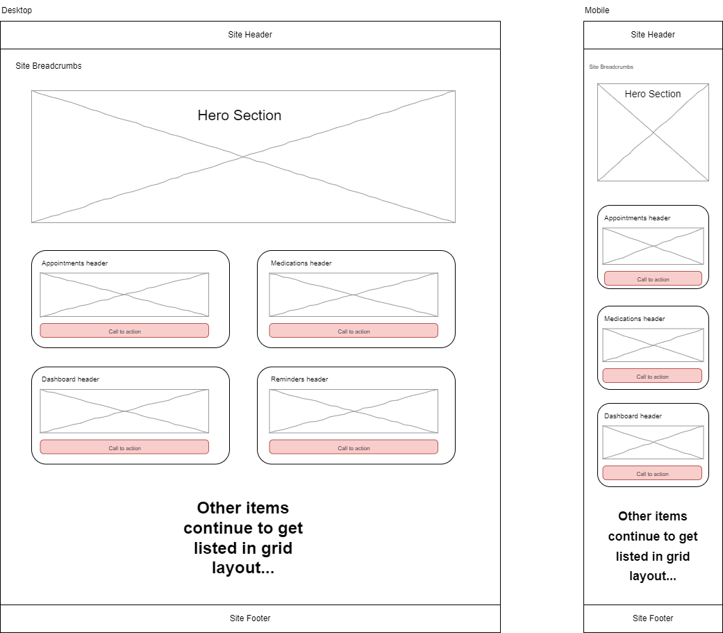
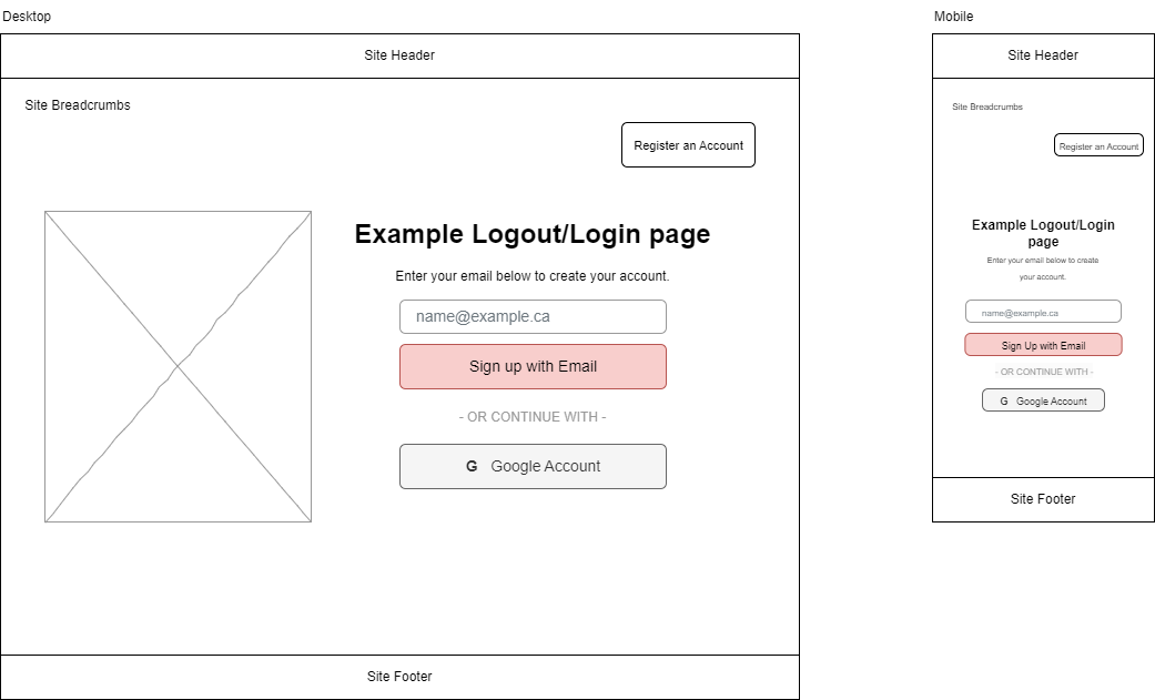
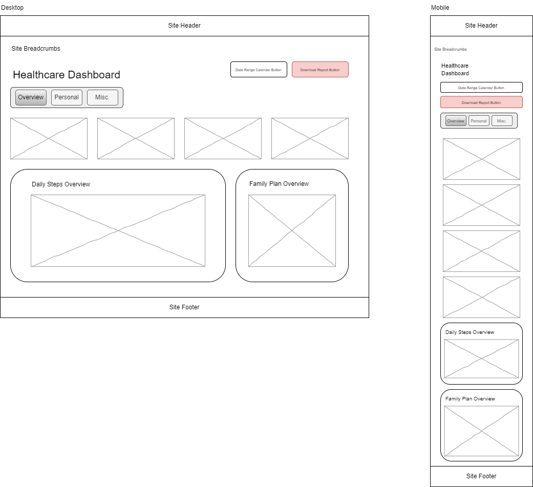
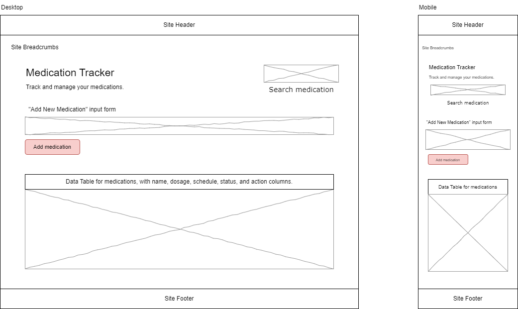
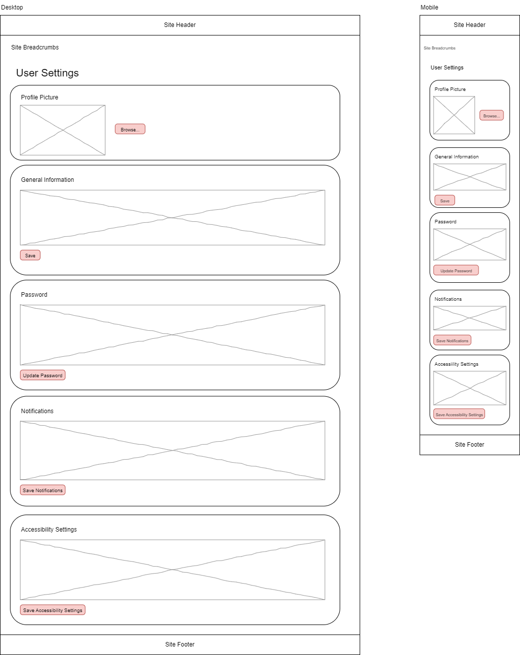
Mid/Low-fidelity wireframes represent the basic structure and layout of the app. They served as an early-stage visual representation of key screens, with a strong focus on the functionality and user flow. This definitely helped with validating the information architecture and core interactions before moving to the high-fidelity.
From user requirments, the key low-fidelity wireframes that got designed were:
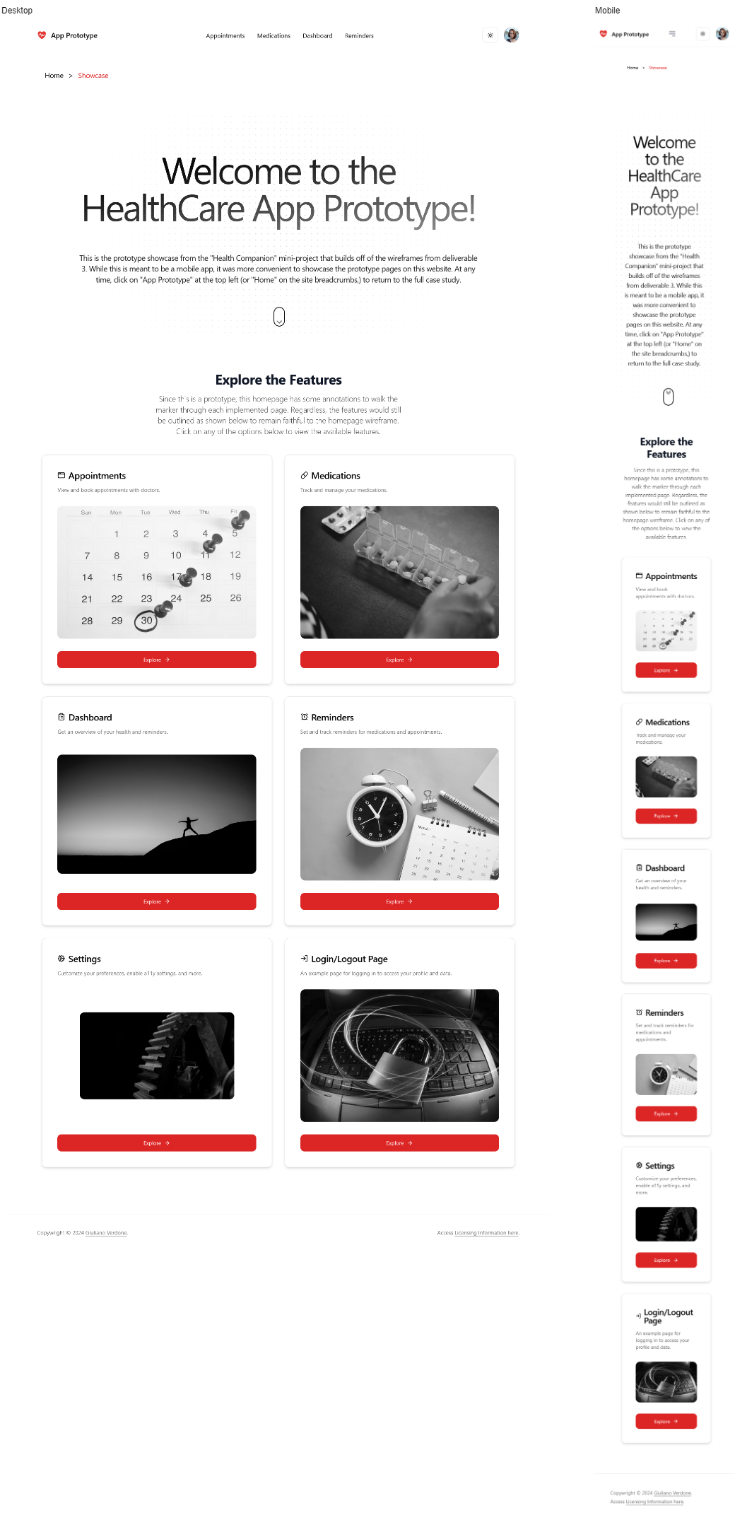
Homepage: An overview of the app’s main functionalities with straightforward navigation.
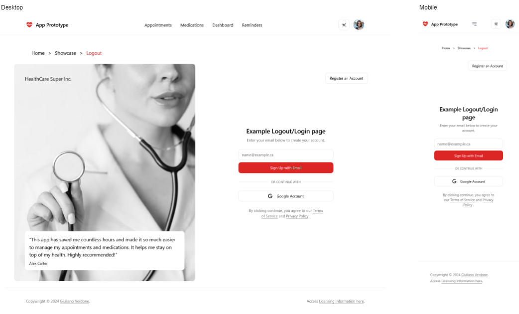
Login and Logout: Simple mock authentication screens that would allow users to access their accounts.
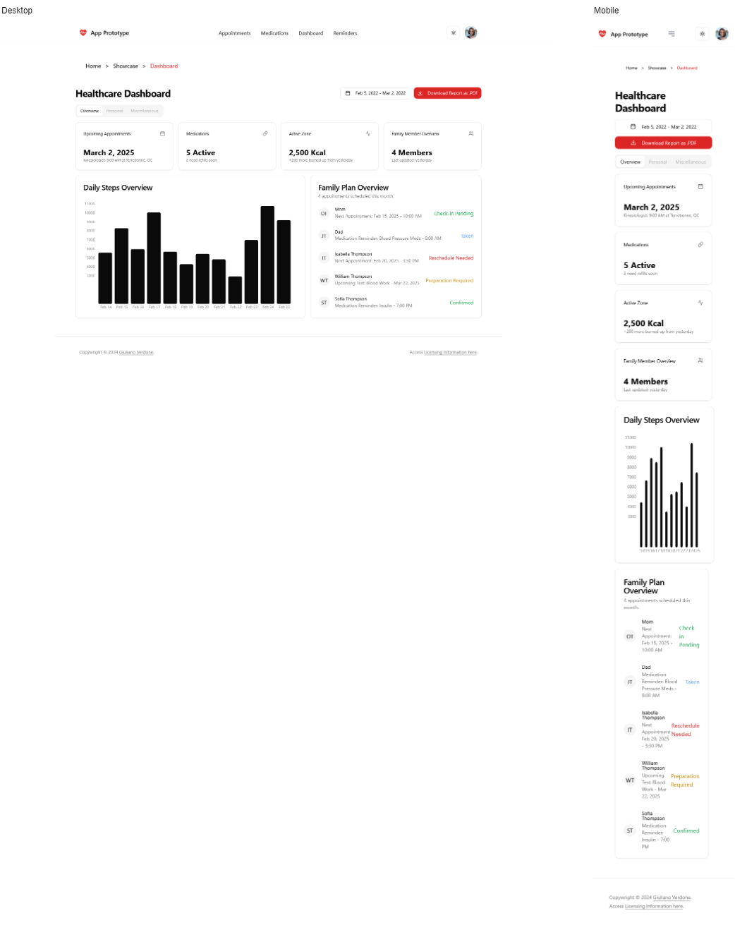
Dashboard: The central hub where users can view important information and access key features. This included family plan information for cross-communication between accounts, as well as detailed metrics that represent connections to external devices like a smart watch (to count steps, track calories, etc.)
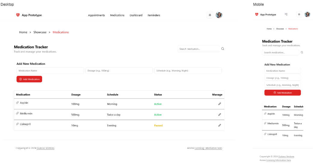
Medications: A screen that helps users track and manage their prescribed medications.
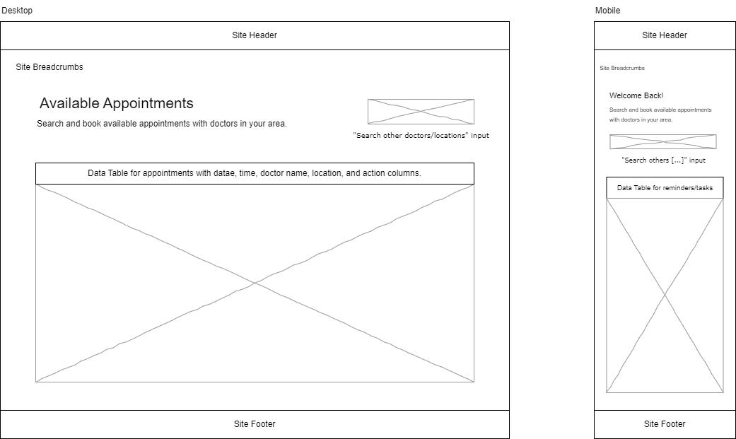
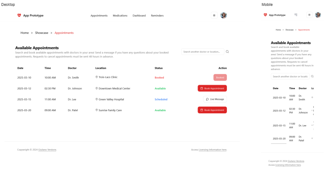
Appointments: Scheduling and managing doctor visits and health checkups. This includes actions to book appointments as well as message doctors or other health professionals in real-time.
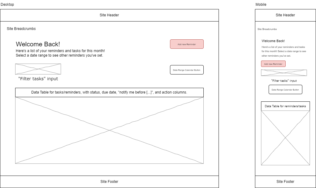
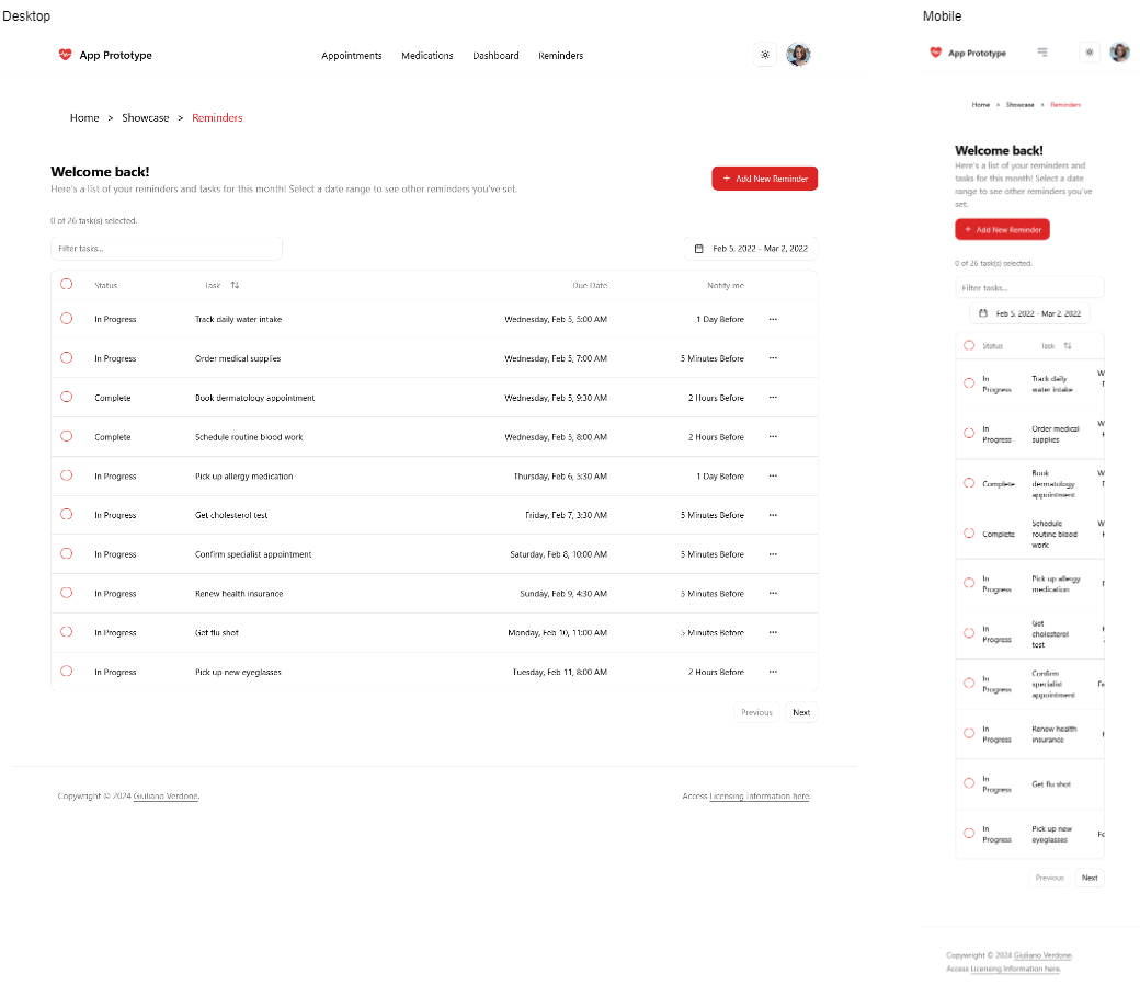
Reminders: A feature to set up personalized alerts for medication intake, appointments, or other health-related tasks.
Settings: Allows users to personalize their visual preferences, update personal details, and configure notifications.
High-fidelity Prototyping: Web Mock-ups
High-fidelity mockups bring the wireframes to life with detailed visuals, colors, typography, and UI elements. These designs simulated the final appearance of the app’s planned features and provide a realistic experience of user flow (interactions, achieving goals, etc.).
Prototype Results
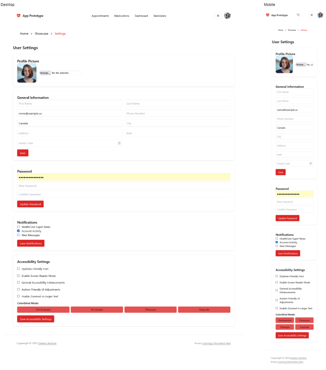
All web mock-ups are shown in light mode. Even though pictures of the high-level mock-ups are shown here, please visit them at their respective URLs for a better experience. For all mock-ups, a stylesheet was used to stay consistent with theming across the board. Colour choice was also kept simple; black and white for background and foreground (swapped for dark mode,) and red as a primary colour (which can easily be configured to a different colour to consider contrast and colourblindness variations).
Homepage
The hompage’s clickable mock-up is available here.
Login and Logout
The login/logouts’s clickable mock-up is available here.
Dashboard
The dashboard’s clickable mock-up is available here.
Medications
The clickable “medications” mock-up is available here.
Appointments
The clickable “appointments” mock-up is available here.
Reminders
The clickable “reminders” mock-up is available here.
Settings
The clickable “settings” mock-up is available here.
Addressing User Needs
Recall the three personas alongside their needs, goals, and frustrations:
Alex Carter - The Young Professional
Needs: A streamlined scheduling system and real-time provider communication.
Goals: Efficient appointment management and reduced missed follow-ups.
Frustrations: Struggles with managing multiple healthcare portals and lack of integration between apps.
How the Mockups Address Alex’s Needs:
The Appointments Mockup simplifies scheduling with a clear, user-friendly interface. This, in turn, reduces the hassle of managing multiple portals.
Real-time notifications in the Dashboard help to ensure that Alex doesn’t miss follow-ups.
The Reminders feature helps him stay on top of medication and check-ups.
Sarah Thompson - The Caregiver Student
Needs: A shared medication reminder system for multiple users.
Goals: Ensure her family stays on top of their medications with minimal effort.
Frustrations: Manual tracking is time-consuming, and apps lack shared scheduling support.
Note that Sarah was used as the example profile in the mockups, which is fitting considering that the dashboard showcases the dashboard and its ability to track reminders for multiple users.
How the Mockups Address Sarah’s Needs:
The Medications Mockup allows Sarah to track multiple people’s medications in a structured format.
The Reminders Mockup enables shared notifications so that her family gets alerts for their medications.
Settings allow preference customization for multiple users connected to account activity, receiving news when new features are added, and new messages.
Mark Davis - The Health-Conscious Senior
Needs: Large text, voice-over support and clear appointment reminders.
Goals: Independently manage his health with an easy-to-use app.
Frustrations: Navigation is often confusing and accessibility features are missing in most apps.
How the Mockups Address Mark’s Needs:
The Dashboard Mockup is designed with a clean, simple layout and reduces navigation complexity.
The Appointments Mockup ensures he gets automated reminders without manual tracking.
Larger text and accessible design elements in the Settings Mockup improve usability for seniors.
Closing Thoughts
Each persona’s pain points were addressed through intuitive features made possible by the power of user-centric design. As I progressed through the User-Centric UX Design Process, it became evident to me why wireframing and visualization are required deliverables in the UI/UX design main stages. I also now understand that they save so much time with regards to drawing out visual graphics and content before implementing them.